Case Study Development Mockup July 25, 2025

Developing Optimizations for Angle 3D in Nyla

Refining a 3D customizer with modular UI, intuitive navigation, and share-ready features—engineered for seamless Nyla integration.

Task

Redesign and optimize the Angle 3D customizer UI/UX to be modular, mobile-friendly, and fully compatible with Nyla’s dynamic data framework, while adding a functional share feature.

  • Strategy

    UX Strategy

  • Design

    UI/UX Design

  • Client

    KAV

Open Project

Background

Goal: Deliver a seamless, brand-consistent customization experience that worked flawlessly on any device, with modern features and scalable architecture.

The original customizer allowed users to visualize and personalize helmets but lacked the refinement, adaptability, and advanced features expected from a modern product configurator.


  • Layouts were inconsistent across devices.
  • Selection states were unclear.
  • Mobile experience fell short of desktop capabilities.
  • No working share feature for saving or distributing builds.
Before After

UI/UX Audit & Desktop Restructure

We conducted a full audit of navigation flow, selection states, and content hierarchy. The old structure caused swatch alignment issues, unclear navigation, and overlapping elements when resizing windows.

Fix:

  • Rebuilt the flexbox structure to ensure elements reposition correctly during resizing.
  • Retained visual hierarchy at all resolutions.
  • Panels, swatches, and the 3D viewer now scale proportionally, avoiding overlap or clipping.

Mobile Experience Overhaul

Mobile users previously faced cramped layouts, small touch targets, and missing desktop-level features, making customization slower and less intuitive. Navigation was inconsistent, selection states weren’t always clear, and core features didn’t translate well to smaller screens.

Approach:
We redesigned the mobile interface with a touch-first mindset, ensuring it matched desktop functionality while optimizing for speed and clarity on any device.

Key Improvements:

  • Complete mobile UI redesign with larger tap targets, refined spacing, and improved scroll behavior.

  • Feature parity with desktop, including consistent tab structures, selection indicators, and customization flow.

  • Responsive adjustments for smooth performance across devices and orientations.

This overhaul created a faster, more intuitive mobile experience that keeps customers engaged from first interaction to final purchase.

Enhanced UI/UX delivered steady gains in the customer journey, removing key friction points and clearing critical barriers to purchase.
+ 0 %
User Throughput
+ 0 %
Task Completion
Before After
Enhanced UI/UX delivered steady gains in the customer journey, removing key friction points and clearing critical barriers to purchase.
+ 0 %
User Throughput
+ 0 %
Task Completion

Polishing Interactions & Streamlining Visibility

Shadow-DOM PDF Export Hide

The legacy PDF export button, embedded deep within the tda-model-viewer shadow DOM, was hidden using a targeted script that continuously checked for its existence until load completion. This was necessary because the new design introduced a custom export button—centered within the updated UI/UX flow—that offered the same functionality but in a way that aligned with the revised interaction patterns.
Impact: Eliminated duplicate controls, reduced potential confusion, and maintained visual focus on the optimized export process.

Stabilizing Layout & Enhancing Visual Hierarchy

Reflow, Scroll-Inner, and Vertical Fade Overlays

To prevent layout shifting during load, a script temporarily hid the customization panel, forced a reflow, then rebuilt its DOM structure within a scroll-inner wrapper. Top and bottom fade overlays were added to signal additional scrollable content. A MutationObserver ensured dynamically added elements were automatically placed within the proper structure.
Impact: Removed distracting visual jumps on load, preserved structural integrity, and provided clearer content boundaries for users.

Mobile Swiper Fades and Safe Reset

For mobile horizontal swipers, left and right fade overlays were injected to indicate additional scrollable items. Long carousels (five or more slides) were reset at load to prevent off-center initialization.
Impact: Improved content discoverability on mobile devices and ensured carousels loaded in the correct position every time.

Matrix-Aware Fade Toggling

A precise fade control system read the .swiper-wrapper transform matrix to calculate scroll positions. Fades appeared only when additional content existed in that direction.
Impact: Offered honest, context-aware visual cues, reducing false affordances.

Maintaining Selection Context & Synchronization

Programmatic Swatch Centering

When a swatch was selected, its position was recalculated to appear in the third visible slot of the swiper, ensuring it remained within a predictable focal point. Class adjustments (prev/active/next) and transformations kept the visual context intact.
Impact: Helped users keep track of their selections while making comparisons easier.

Tab-to-Content Swiper Synchronization

A script linked tab navigation with the content swipers, forcing instant updates and re-centering without animation to prevent flicker. Multiple checks ran within milliseconds to account for late asset or style loads.
Impact: Delivered instant, stable transitions between customization categories.

Branding & Load-State Enhancements

Branded Loading Screen Injection

Default loading assets were replaced with brand-specific visuals and typography, ensuring a consistent aesthetic from the very first interaction.
Impact: Reduced perceived wait time and reinforced brand identity throughout the experience.

Deferred Swiper Update & Global Resize Nudge

After the initial load, a timed update forced all swiper instances to recalculate dimensions and positioning, followed by a global resize trigger.
Impact: Prevented post-load element drift and preserved layout consistency.

Commerce State Feedback

Out-of-Stock Overlays

When items were unavailable, scripts detected “out of stock” text in the ATC button and applied frosted overlays to relevant UI sections. This applied to both desktop and mobile layouts, with boundaries tailored to each.
Impact: Communicated availability instantly, preventing wasted interactions and disappointment late in the purchase process.

Utility Hooks & Structural Resilience

Public Fade Update Hook

A global function was exposed to allow other modules to trigger a fade recalculation when necessary.
Impact: Kept fades visually correct during real-time UI changes, maintaining interface polish.

MutationObserver for Dynamic Content

Automatically routed new content nodes into the correct structural wrappers and refreshed fades/swiper layouts as needed.
Impact: Supported dynamic, asynchronous updates without sacrificing design consistency.

Tab Swiper Initialization Timer

Shortly after DOM load, a timed script forced tab swiper updates and global resize events to reconcile late-loading styles or fonts.
Impact: Ensured the first interactive frame was visually and structurally correct.

Feature Development & Scripting

A significant portion of the overhaul focused on custom JavaScript development and targeted CSS refinement to resolve interaction issues, enhance functionality, and ensure long-term stability.

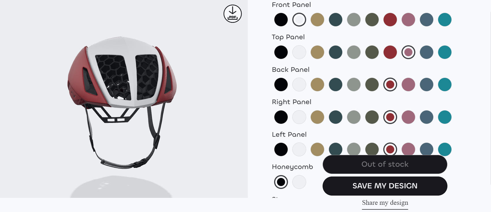
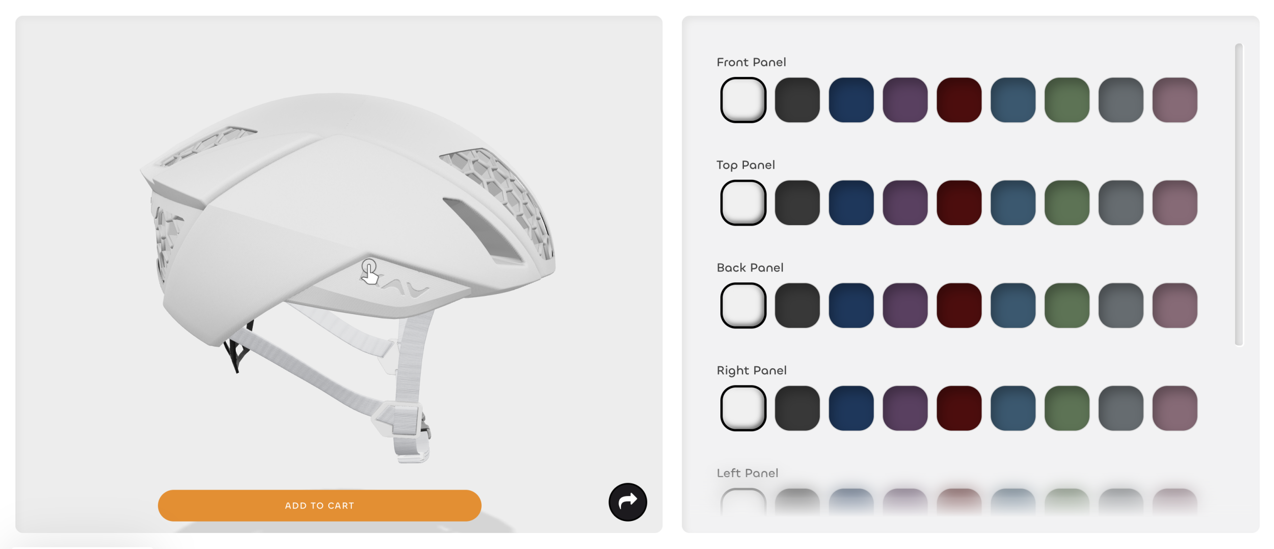
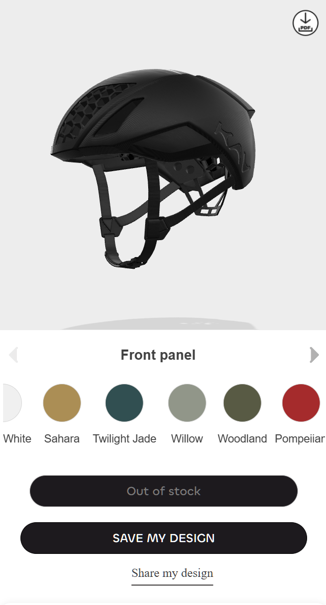
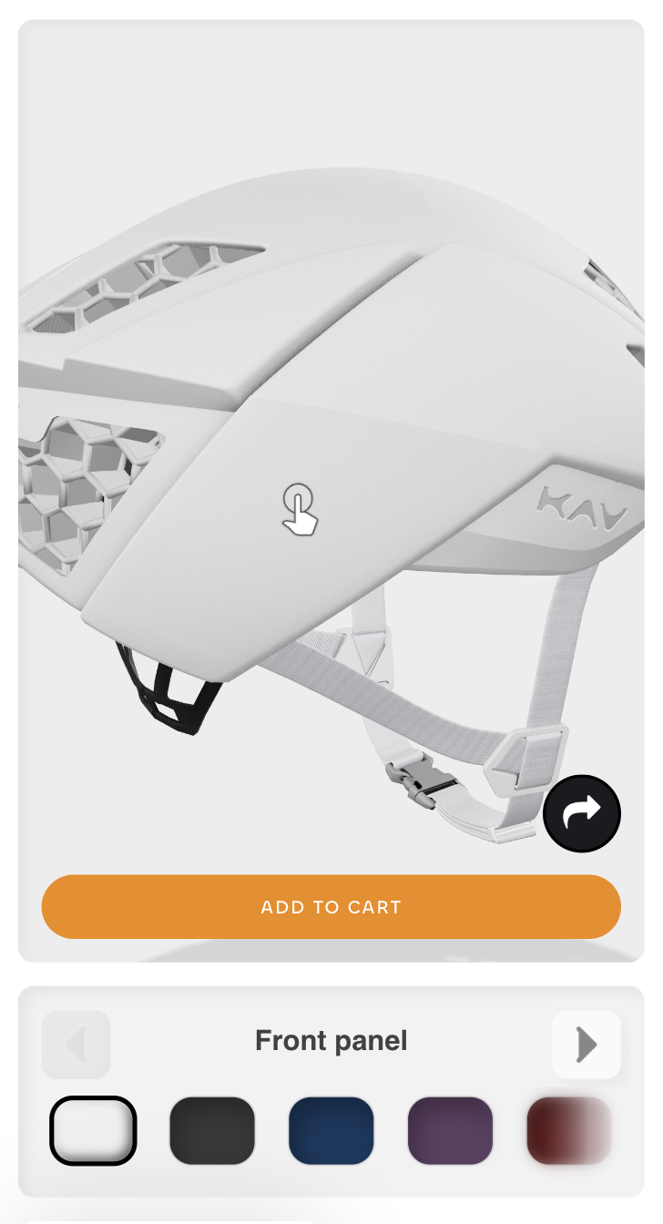
On the JavaScript side, we engineered a suite of modular scripts to address persistent layout shifts, introduce dynamic fade overlays for improved visual hierarchy, synchronize tab navigation with swipers, and provide instant feedback through “out of stock” indicators. Each script was purpose-built to integrate seamlessly into the new architecture, maintaining consistent behavior across both desktop and mobile environments.

Complementing these functional improvements, we applied over 100 targeted CSS modifications to redefine the visual identity of the customizer. This included redesigned swatches and panels, refined spacing, enhanced shadows, rounded corners, and fully responsive container layouts. Together, these changes not only aligned the interface with brand standards but also improved touch precision, visual clarity, and overall user comfort.

By combining robust scripting with a meticulous visual overhaul, we created a customization experience that is both technically reliable and visually polished, setting a strong foundation for future scalability.

Conclusion & Reflection

User Experience Transformation
We eliminated navigation friction, clarified selection states, and ensured desktop-level functionality on mobile devices. This created a consistent, intuitive experience across all platforms.

Technical Enhancements
Custom JavaScript modules and over 100 targeted CSS updates introduced fade overlays, fixed persistent layout shifts, added real-time stock indicators, and streamlined UI elements for better maintainability. The CSS overhaul refined every visual layer — from swatch and panel styling to shadows, spacing, and responsive breakpoints — creating a tactile, polished interface that reinforced brand identity.

Data & Scalability
Rebuilding the integration with Nyla’s dynamic data framework enabled instant visual updates, reduced manual intervention, and positioned the platform for effortless expansion to future helmet models and variations.

Impact
The result is a cleaner, faster, and more reliable customization tool that strengthens customer confidence, removes purchase barriers, and supports long-term brand growth.

Back

Leave a Reply

Your email address will not be published. Required fields are marked *

This website stores cookies on your computer. Cookie Policy