
Hoek Creative & Co — Brand Identity Design
Comprehensive brand identity design by Hoek Creative & Co, delivering custom assets, cohesive branding, and creative visuals for standout businesses.
-
Strategy
Brand Identity, Design
-
Design
Logo Design, Art Direction, Branding
-
Client
Hoek Creative & Co.
Background
Goal: Establish a bold and cohesive visual identity for the launch of Hoek Creative & Co. The objective was to craft a logo and brand system that communicates our values of precision, creativity, and modern design thinking—ready to scale from day one.
As a brand-new studio, we had no existing identity—this was a clean slate.
No pre-existing logo, color system, or typography standards.
Needed a visual identity that reflects both strategic depth and creative vision.
Brand system had to feel timeless, distinct, and adaptable across formats.
Required immediate functionality for both digital and print applications.
Color palette
/ Foundations
| Primary #424874 | ◯ | |
| R 66 G 72 B 116 |
Indigo Blueprint
| Secondary #5D5F6B | ◯ | |
| R 92 G 95 B 107 |
Graphite Fog
| Text #A8A8A8 | ◯ | |
| R 168 G 168 B 168 |
Soft Ash
| Accent #E67E22 | ◯ | |
| R 230 G 126 B 35 |
Studio Ember
Hoek Creative & Co. was founded on the idea that structure enables creativity. Our identity balances expressive ideas with geometric logic—creating a system that feels both playful and precise, modern yet timeless.
We craft identity systems that scale—adapting seamlessly across print, digital, and motion. For Hoek, we focused on modularity, logo mark adaptability, and a refined palette that reflects confidence, approachability, and purpose.
Typography
/ Design
Typeface
Fiona
Usage
Main wordmark
Aà
A refined serif chosen for its balance of structure and elegance. It brings clarity, timelessness, and a sense of craft to the core brandmark.
AaBbCcDdEeFfGgHhIiJjKkLlMmNnOoPpQqRrSsTtUuVvWwXxYyZz 0123456789
Typeface
Neue Kabel
Usage
Tagline
Aà
A clean, modern sans-serif that adds contrast and approachability. Its geometric rhythm supports legibility and contemporary tone.
AaBbCcDdEeFfGgHhIiJjKkLlMmNnOoPpQqRrSsTtUuVvWwXxYyZz 0123456789
Typeface
Canela
Usage
Headlines
Aà
A modern serif that balances softness and strength. It lends sophistication and warmth to headline moments without overpowering the brandmark.
AaBbCcDdEeFfGgHhIiJjKkLlMmNnOoPpQqRrSsTtUuVvWwXxYyZz 0123456789
Typeface
Söhne
Usage
Body elements
Aà
A contemporary grotesk inspired by classic forms. It offers clarity, neutrality, and excellent readability across all digital and print touchpoints.
AaBbCcDdEeFfGgHhIiJjKkLlMmNnOoPpQqRrSsTtUuVvWwXxYyZz 0123456789
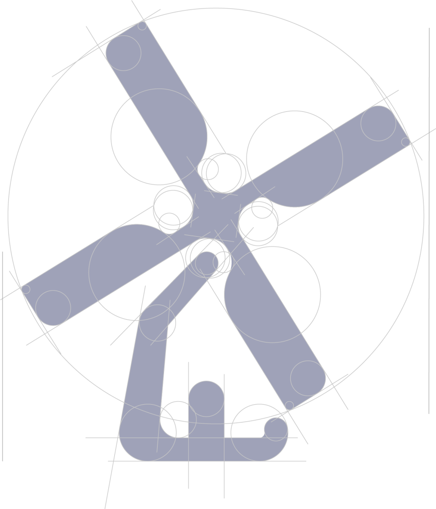
Refined Geometry for Lasting Impact
Every curve and angle in the Hoek Creative & Co logo was meticulously constructed using geometric principles to ensure balance, symmetry, and visual clarity. The use of overlapping circles and clean line intersections reflects the studio’s approach: bold creativity rooted in thoughtful structure. This diagram reveals the hidden framework that gives the logo its timeless, scalable form.
Logo Construction
/ Diagram
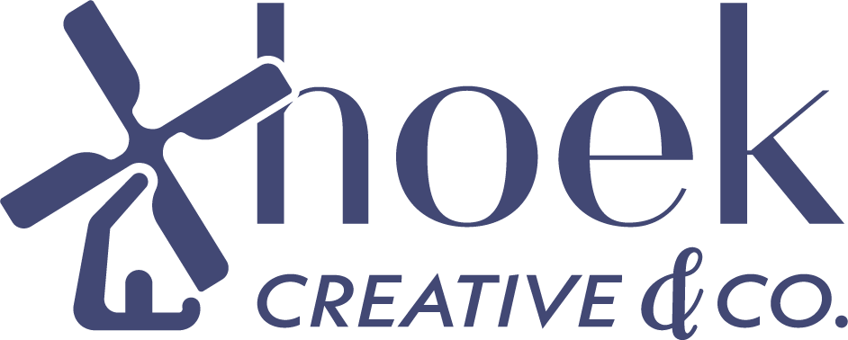
Final Logo
/ Design
Conclusion & Reflection
Designing the brand identity for our own studio was both a rewarding and revealing process. It gave us the opportunity to pause and articulate who we are—not just through words, but through form, color, and structure. Every detail of the identity was built to reflect the balance we strive for in our work: thoughtful, intentional design with a creative edge.
This project pushed us to clarify our visual language and apply the same level of rigor to ourselves that we offer to our clients. From refining the geometry of the logo to establishing a scalable design system, we created a brand that feels true to who we are and where we’re headed.
More than a logo, this system gives us the foundation to grow—with consistency, clarity, and confidence.